Rebranding the Lithuanian Zoo.
Design concept. Before the renovation.
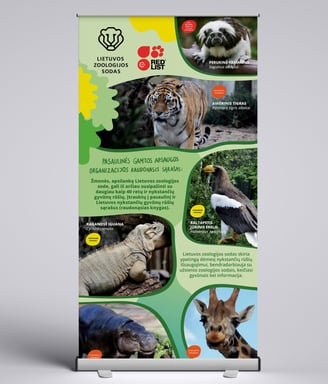
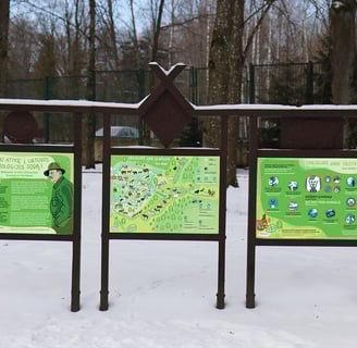
Visitors to the Lithuanian Zoo are families with children, schoolchildren, and adults. We need to send a message to all these groups about sustainability, ecology and the importance of biodiversity. To achieve this, the image of the zoo must be attractive to all these groups. The information must be presented in a clear and understandable way, the visuals must convey positive emotions to visitors, link the zoo to our conservation and education work. The choice of print media, promotional objects and and events, it is important to choose sustainable design solutions.

Remember, Learn, Cherish.
Image standards: clarity, attractiveness; hospitality, openness; friendliness to nature.
"Remember, Learn, Cherish" is the motto of the Lithuanian Zoo. This slogan speaks of the importance of knowledge. It reflects the mission of the Lithuanian Zoo and its educational work.
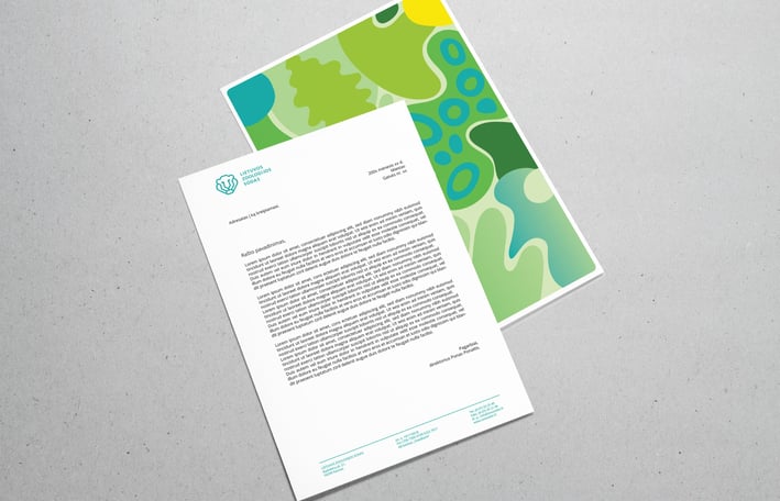
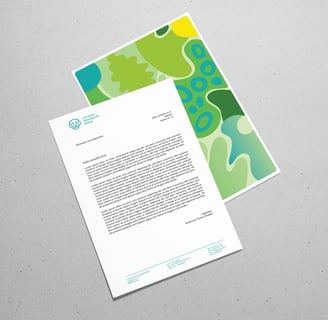
Zoo logos.
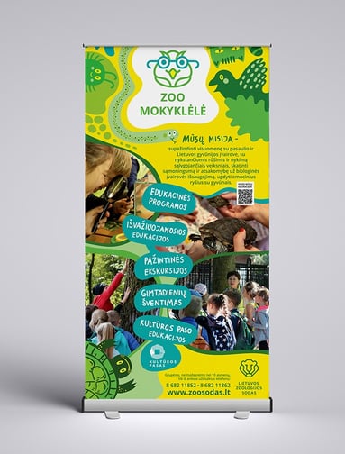
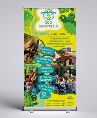
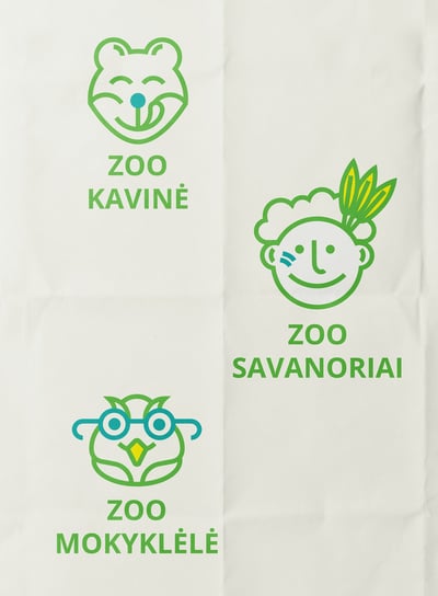
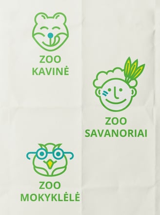
Additional logos used at the Lithuanian Zoo include Zoo School, Zoo Café and Zoo Volunteers. These logos are related to the main logo, visually similar, but more playful and childlike. The Zoo School logo is aimed at a children's audience, while the Zoo Café logo is aimed at visitors. The Zoo Volunteers logo is aimed mainly at young people. The main audience of the Lithuanian Zoo is families with children. The Zoo Café logo should therefore be playful and fun, evoke positive emotions and invite people to come in. The zoo's anniversary logo was also designed: 80 years of the zoo.
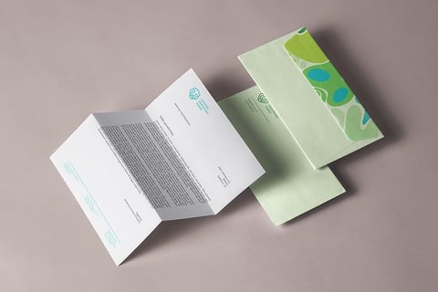
Zoo colors.
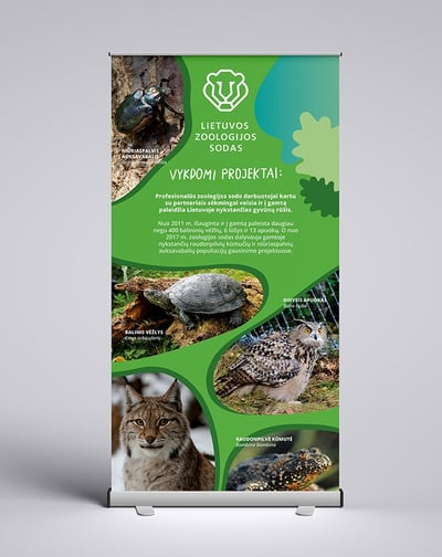
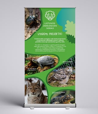
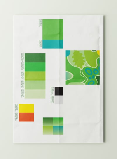
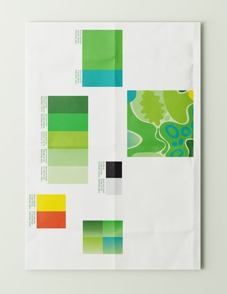
The color palette of the Lithuanian Zoo is inspired by the Oak Park. The Lithuanian Zoo is located in an oak forest. It is home to centuries-old oak trees. Our zoo is unique in this respect. So the zoo like a Park image must be maintained and emphasised. Orange, yellow and sea blue are used to accentuate and emphasise something. They are also used to highlight or enliven illustrations, ornaments or other graphic elements. Color gradients are used in graphic elements and backgrounds. Color gradients can only be made up of our brand colors.
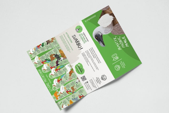
Iconography.
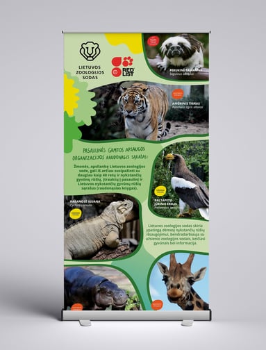
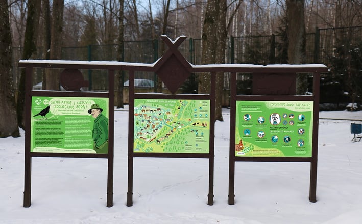
Icons are designed to convey information clearly and concisely. They must be clear, understandable and use simple symbolic signs that can be understood by all. These icons are used in signage, zoo publications, warning and directional signs, etc. The colours of the icons can be changed and adapted to the situation. However, only black, branded blue, white and branded orange combinations are used! Shades of green are not used in these icons.
Illustrations.
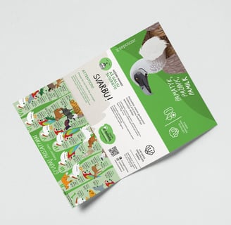
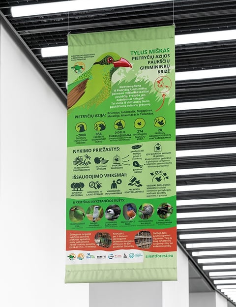
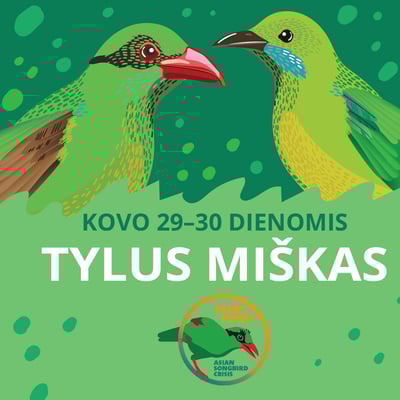
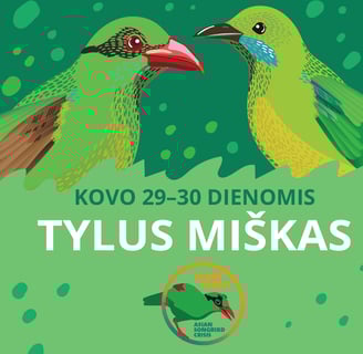
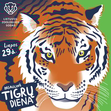
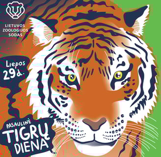
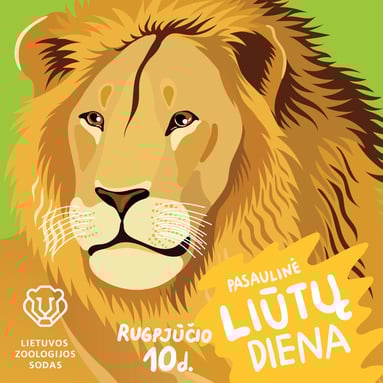
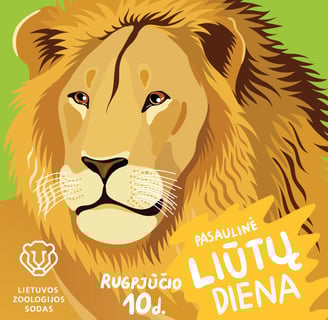
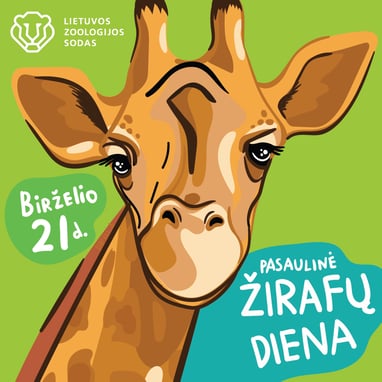
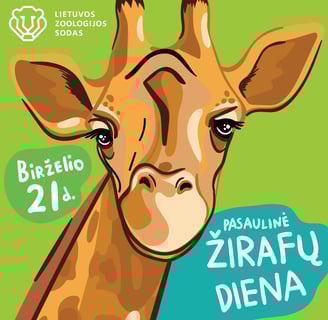
Illustrations are one of the main graphic elements used in the Zoo's various promotional projects, publications and communications. It can be used alone, combined with photos, etc. The main illustrations should be quite realistic, with realistic animals. More playful illustrations can be used for holidays and children's events.
Let's not forget, we had our own trolleybus!


